Tuesday, 18 January 2011

Q7 Looking back at your preliminary task, what do you feel you have learnt in the progression from it to the full product?


Through the whole journey of creating this media product, I've learnt so much about the research, planning and producing of the magazine. I've found that these three factors are essential to creating a professional looking magazine. I learnt that applying the knowledge you gain from your market research to the final product, really helps to make sure you're attracting the right audience in the right way, and instantly giving yourself a reputation to this market. 

There are still things that I think I would improve on in the future, like playing around with the layout of the first double page spread of the features page, as the layout and the way magazines are put together may not be best suited. 

But, overall I am very pleased with my magazine, as I think it looks quite professional in the final outcome, with a long time perfecting paying off. I really enjoyed the making of the whole coursework and hopefully this can be seen from the finalisation of the project. 

Sunday, 16 January 2011

Q6 What have you learnt about technologies from the process of constructing this product?


By pressing the right arrow button this will take you through the presentation, to zoom in further, for example on small text, simply use the scroll on the mouse to control the intensity of the zoom.

Thursday, 13 January 2011

Q5 How did you attract/address your audience?

Facebook
When coming up to finishing my magazine, I used the social networking site Facebook to gain feedback from my target audience. I thought this would be a good place to gain responses as the majority of 'friends' I have on here are within the 16-24 age group.


I found that I got some useful feedback from this, and recieved some positive opinions on the way it looks. This shows me that I've met the needs of my target audience. After recieving the feedback, I made some minor changes to the cover to improve it do verify  it as my final draft.

Survey Monkey

When my magazine was finally finished, I wanted some more feedback to help me tell if I had met the needs of my target audience fully. I used Survey Monkey to do this, and sent this link to fellow media students, and other members of my target audience. I used both open and closed questions, so that i recieved opinions as well as basic yes/no answers.


From looking at my results, I've found that overall all of the people who took my survey, voted that they liked my magazine. This is a great relief as nobody said that they disliked the magazine. I've also recieved feedback on what I could have improved on, as well as the area's in which they think I did well. But generally, the feedback was really good, and specificly told me what was good and what wasn't so good. This information is vital when looking back over it, and finding out where my target audience would want my magazine to be improved.

(Click the images to enlarge them)

Wednesday, 12 January 2011

Q4 Who would be the audience for your media product?


By pressing the right arrow button this will take you through the presentation, to zoom in further, for example on small text, simply use the scroll on the mouse to control the intensity of the zoom.

Tuesday, 11 January 2011

Q3 What kind of media institution might distribute your media product and why?


After researching into many different distributor institutions, I decided on Bauer Media for many reasons. 

Bauer Media has potential as they publish Kerrang, Q, Mojo and Empire, so they are able to publish well known music magazines with a similar target audience to my magazine. They also publish magazines like Heat and Practical Photography, which are also two magazines that my target audience may also be interested in. On top of this, they are also involved in TV channels like 4Music and The Box, showing chart music which my target audience are interested in and probably watch these channels. They've even involved in radio stations like Kiss and Kerrang, giving a good mix of genres that they cover throughout. 

This is what I want to give from my magazine, so I feel that this mix of genres and forms of distribution would be perfect for The Mix. 

Q2 How does your media product represent particular social groups?


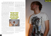
 When taking my images for the main features page and front cover, I wanted to get some some good quality images, showing both serious and fun poses. The focussed ones representing the serious side of the bands music career, but also capture some more fun and uplifting images to show the fun side of both them and them within their social group, whom are my target audience. I involved colour and style when deciding on Jamie's appearance.  The white t-shirt and slightly long hair worked really well with the type of music he's creating, and represents the target audience as many of them would dress in a similar style. 


Q1 In what ways does your media product use, develop or challenge forms and conventions of real media products?

Thursday, 6 January 2011

Final Changes To Features Page


Above Left: First Draft
Above Right: Final Draft

I moved the smaller picture of the frontman Jamie Ellis underneath the pull quote, as it looked much less awkwardly positioned than it did before. I also helps the text to flow all around the picture and caption without cutting it short where it used to be. I also added a caption onto the smaller picture saying 'Front man Jamie Ellis: in a trance'. This adds to the professionality of this page as I found from my research that captions are used often, especially on features pages.


When in the dilemma of what to do with the text in the centre of the page, I tested out a different idea of having the text in the matching yellow colour and stretch it across the bottom of the page. But in comparison with the older design I think that it didn't look as professional as it did before, so decided to come to a different resolution.


In my first draft, I realised that the text in the middle of the page on the first double page spread would be cut out if it were to be published as this is where the crease of the pages would lie. This would cause stress upon the reader trying to understand what the text says. So, to resolve this, I made two separate text boxes and split the text, still making sure that if they were put together then it would read as normal. The idea of this is that when the magazine pages are all stapled together this will bring the two text boxes together so that it reads as normal.


To finish off the page, the addition of page numbers in the bottom corner of each page was essential, as this really ups the look of the page. It tells the reader where they are in the magazine, and follows the conventions of the majority of other magazines. 

Tuesday, 4 January 2011

Final Changes To Contents Page


Above Left - First Draft
Above Right - Final Draft


On the heading saying 'Unseen pictures of Green Day's stadium tour', I first added a circle with the page number inside as you can see on the top right picture, but then changed it to an arrow pointing to the text instead, shown in the bottom right, as i thought this would appear clearer to the reader. This straight away tells the reader where to turn to find this article, without having to search through the list of the contents on the bottom half of the page. This keeps interest levels of the consumers, and makes them want to continue reading the magazine.


The 'Top Picks' section looked too 'boxy' before, and to improve this I changed the text to have no line. The image on the above left shows how I did this in the 'Line and Border' tool box. Abover right is the newly improved section, looking much better without the boxes. I also enlarged the headings of the titles above each piece of text, and added a space between the end of the quote and the name of the staff that have given their opinion.


Monday, 3 January 2011

Final Changes To Front Cover


Above Left: First Draft
Above Right: Final Draft

From looking at both the above images, it's clear to see what improvements I have made on the front cover of my magazine. 

The masthead has increased in size as I feel this makes the whole page look much more eye-catching, and also works better with the main image. 
The main image of the page now overlaps the masthead, giving it a much more professional look. I did think by copying and pasting the image, using the 'irregular crop' tool to crop around the head as you can see from the screen-shot on the right.

I then added in layers onto the page of my front cover to make it possible for the cut out image to overlap onto the masthead. The four layers I sectioned the page into are shown on the left. 
I also enhanced the fonts on quite a few parts of the cover, for example on the strip at the top of the page and the circlular, sticker-like puff using more appropriate fonts. 

- As well as this, I added a subheading underneath the masthead saying 'Artists - Genres - Music' making it clearer to the audience what 'The Mix' is about. 

- I made some of the text smaller around the page too, as i wanted the audience's focus to be mainly on the 'Skies Of Until' heading and story, also helping them to know what relevance the picture had and which caption it links up with.