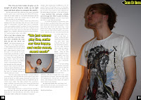

Above Left: First Draft
I moved the smaller picture of the frontman Jamie Ellis underneath the pull quote, as it looked much less awkwardly positioned than it did before. I also helps the text to flow all around the picture and caption without cutting it short where it used to be. I also added a caption onto the smaller picture saying 'Front man Jamie Ellis: in a trance'. This adds to the professionality of this page as I found from my research that captions are used often, especially on features pages.
When in the dilemma of what to do with the text in the centre of the page, I tested out a different idea of having the text in the matching yellow colour and stretch it across the bottom of the page. But in comparison with the older design I think that it didn't look as professional as it did before, so decided to come to a different resolution.
 In my first draft, I realised that the text in the middle of the page on the first double page spread would be cut out if it were to be published as this is where the crease of the pages would lie. This would cause stress upon the reader trying to understand what the text says. So, to resolve this, I made two separate text boxes and split the text, still making sure that if they were put together then it would read as normal. The idea of this is that when the magazine pages are all stapled together this will bring the two text boxes together so that it reads as normal.
  To finish off the page, the addition of page numbers in the bottom corner of each page was essential, as this really ups the look of the page. It tells the reader where they are in the magazine, and follows the conventions of the majority of other magazines.


No comments:
Post a Comment